Bootstrap is a front end open-source toolkit which makes it really easy to build responsive UIs quickly. With comprehensive documentation and a library of examples it’s a wise choice if you want to build a React app with a tidy front end quickly. In this post I’ll show you how to import and use Bootstrap in a React app, and specifically how to build and style a form, incorporating other Bootstrap components including Alert and Bootstrap button. Read on for a tutorial showing how to build a react-bootstrap form…..
Table of contents
Prerequisites
You’ll already need to have Node and npm installed on your machine (read this blog post if you need help installing and running node js). To build an app that has a working form in it using React and Bootstrap, follow these steps.
- Create a new React app
- Install Bootstrap using React Bootstrap
- Start editing the React code
- Add more Bootstrap components to make a whole form
Create a React app
Navigate to where you want your code to be located in your folder structure using your preferred command line tool, and create your React app in the normal way (I’m presuming that you already have a basic understanding of creating and editing a React app). I’ll call my project ‘react-bootstrap-forms’.
npx create-react-app react-bootstrap-forms
Install react-bootstrap package in your React app
To import Bootstrap to a React app, use the npm package react-bootstrap. On the command line type:
npm install react-bootstrap bootstrap
Then type npm start and make sure the app runs ok in the browser – you should see the default React app template screen.
Start editing the React code
Now open App.js and replace the contents of the whole file with this code:
import React, { useState } from "react";
import "bootstrap/dist/css/bootstrap.min.css";

import Button from "react-bootstrap/Button";

import "./App.css";

function App() {
  const [message, setMessage] = useState("");

  return (
    <div className="App">
      <header className="App-header">
        <p>
          React Bootstrap <code>Form Examples</code>.
        </p>
      </header>
      <p>We will build a form here....</p>
      <Button onClick={() => setMessage("You clicked the button")}>
        Click Me
      </Button>
      <p>{message}</p>
    </div>
  );
}

export default App;
And open App.css, find .App-header and change the min-height value from 100vh to 20vh.
Now on your command line, run your app:
npm start
… and you should see this:
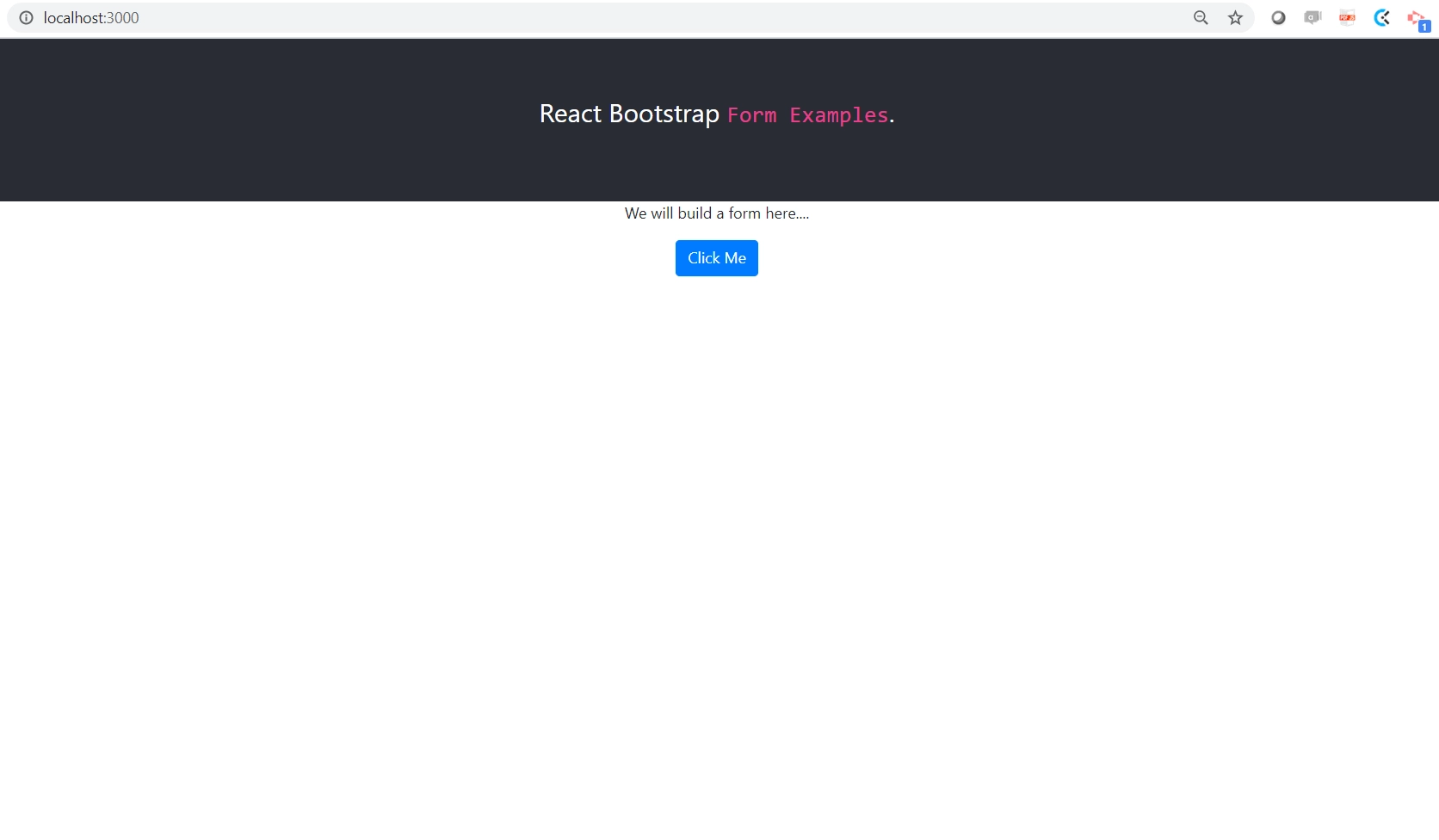
… after you click the button you’ll see a message appear. So this is using a Bootstrap button, along with some of the basic styles that are set up with the React app (read more about building a react bootstrap button). You can do away with those (App.css) altogether if you want, or use them side by side.

Add more components to the react-bootstrap form
Adding a few more Bootstrap elements into the mix (Container, Jumbotron, React bootstrap Alert) and you can see we start to build up a nicely styled react-bootstrap form, with a couple of Text Inputs and some layout detail using Rows and Columns. You can find all the information you need about them here.
Now replace the contents of App.js with this code:
import React, { useState } from "react";
import "bootstrap/dist/css/bootstrap.min.css";
import Container from "react-bootstrap/Container";
import Row from "react-bootstrap/Row";
import Col from "react-bootstrap/Col";
import Button from "react-bootstrap/Button";
import Jumbotron from "react-bootstrap/Jumbotron";
import Form from "react-bootstrap/Form";
import Alert from "react-bootstrap/Alert";
import "./App.css";
function App() {
const [showMessage, setShowMessage] = useState(false);
return (
<div className="App">
<header className="App-header">
<p>
React Bootstrap <code>Form Example</code>.
</p>
</header>
<Container className="p-3">
<Container>
<Row>
<Col>
<Alert show={showMessage} variant="success">
<Alert.Heading>Success</Alert.Heading>
<p>
This is an alert, and these can be shown in a variety of
styles provided by Bootstrap. Our form submit button simply
shows this alert. Another post will go through form validation
and errors.
</p>
<hr />
<div className="d-flex justify-content-end">
<Button
onClick={() => setShowMessage(false)}
variant="outline-success"
>
Close this alert
</Button>
</div>
</Alert>
</Col>
</Row>
<Row>
<Col>
<Jumbotron>
<h1 className="header">Our form</h1>
<p>
We will build a form here. You may want to use this as
login instructions, or some kind of product intro.
</p>
<p>
This is an h1 tag and paragraph in a Jumbotron, which is the
first column in a row of two columns.
</p>
<p>
Here is a selection of buttons showing some of the different
styles available from Bootstrap. You can
<a href="https://react-bootstrap.github.io/components/buttons/">
read more here
</a>
.
</p>
<hr />
<Button variant="outline-primary">Primary</Button>{" "}
<Button variant="outline-secondary">Secondary</Button>{" "}
<Button variant="outline-success">Success</Button>{" "}
<Button variant="danger">Danger</Button>{" "}
<Button variant="info">Info</Button>{" "}
</Jumbotron>
</Col>
<Col>
<Form>
<Form.Row>
<Form.Group as={Col} controlId="formGridEmail">
<Form.Label>Email</Form.Label>
<Form.Control type="email" placeholder="Enter email" />
</Form.Group>
<Form.Group as={Col} controlId="formGridPassword">
<Form.Label>Password</Form.Label>
<Form.Control type="password" placeholder="Password" />
</Form.Group>
</Form.Row>
<Form.Group controlId="formGridAddress1">
<Form.Label>Address</Form.Label>
<Form.Control placeholder="Street Name" />
</Form.Group>
<Form.Group controlId="formGridAddress2">
<Form.Label>Address 2</Form.Label>
<Form.Control placeholder="Apartment, studio, or floor" />
</Form.Group>
<Form.Row>
<Form.Group as={Col} controlId="formGridCity">
<Form.Label>City</Form.Label>
<Form.Control />
</Form.Group>
<Form.Group as={Col} controlId="formGridState">
<Form.Label>State</Form.Label>
<Form.Control as="select" defaultValue="Choose...">
<option>Choose...</option>
<option>...</option>
</Form.Control>
</Form.Group>
<Form.Group as={Col} controlId="formGridZip">
<Form.Label>Zip</Form.Label>
<Form.Control />
</Form.Group>
</Form.Row>
<Form.Group id="formGridCheckbox">
<Form.Check type="checkbox" label="Check me out" />
</Form.Group>
<Button
variant="primary"
size="lg"
onClick={() => setShowMessage(true)}
>
Submit
</Button>
</Form>
</Col>
</Row>
</Container>
</Container>
</div>
);
}
export default App;
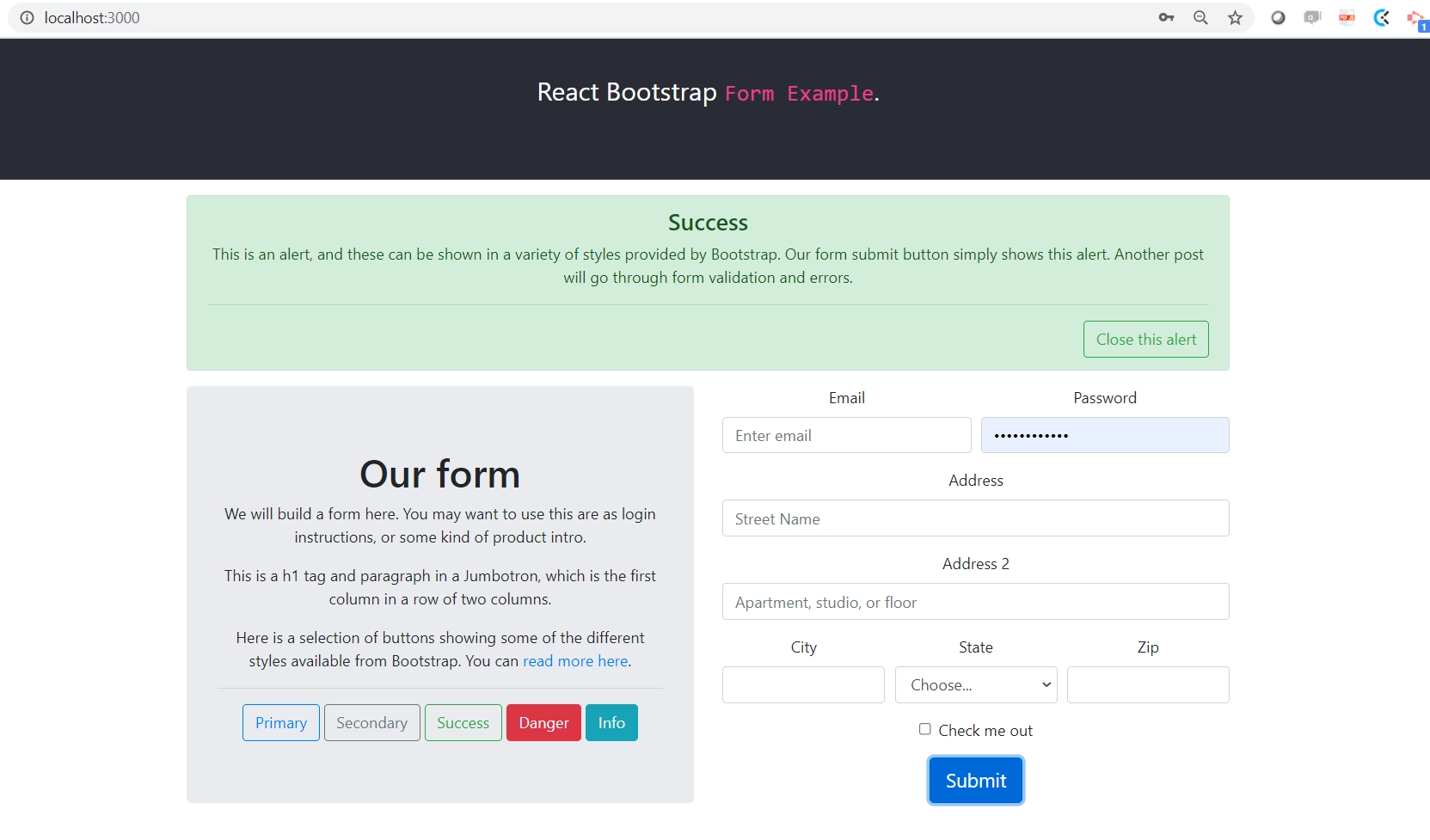
A React Bootstrap form example
As a result of those changes, when you save your file you should see this fully working React Bootstrap form example in your browser:
Summary
So you’ve built a form using React Bootstrap, including different styles of buttons, a text input, a dropdown menu, and an alert message that you can dismiss. I’ve written a second part to this post which covers how to handle the form submission and form errors using React and Bootstrap. I’ve also written a post explaining how to get data from an API using React JS, and another explaining how to use Bootstrap Icons in a React app.
If you are new to developing you may also like my blog post that will teach you how to debug a React JS website using Chrome Developer Tools. As a software dev you will also need to understand and use Git, I’ve written a blog post introducing Git in plain English.