I had to build a website recently that used react-bootstrap and had a page which showed a collection of items in a grid, with each item being shown in it’s own <Card />. The documentation wasn’t as comprehensive as I’d have liked for this specific use case and I found a lot of other people on Stackoverflow asking the same question – namely “how can I show react-bootstrap cards in a grid and control how many per row”. So I’ve put together an example here showing how to do that. My example uses react-bootstrap (I’ve written a post before about using Bootstrap with react) and explains how to show the Bootstrap Card component in a grid. I’ve also written a post explain how to use the React Bootstrap Card component itself, in case you need that to get started.
Table of contents
Prerequisites
This example presumes that you know how to create a React app and the basics of building components. In this example we’ll build a component which gets some data from an API and then navigates the data to create a set of cards arranged in a grid.
Setting up the grid in the React component
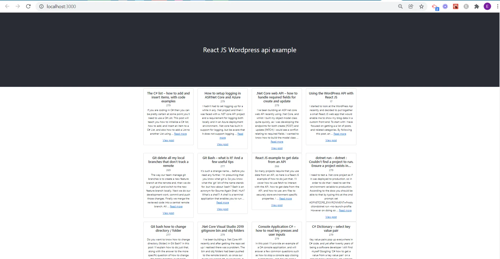
The behaviour you want for your cards and grid may vary a little from this, but this should give you the foundation you need to understand how it works and therefore to create your own custom component. I wanted my cards to be shown in a grid of 4 columns, and for the 4 columns to reduce to 1 column on mobile devices. Most of the control of this is done in this line of code:
<Row xs={1} md={columnsPerRow}>
The roles of xs and md are fully described in the react-bootstrap documentation here. The value of columnsPerRow is specified at the top of the file, as 4. If you change that to 3 and save, your website will reload with only 3 columns showing in the grid.
import React, { useEffect, useState } from 'react';
import apiData from '../services/wordpressApi';
import parse from "html-react-parser";

import "bootstrap/dist/css/bootstrap.min.css";
import Row from 'react-bootstrap/Row';
import Col from 'react-bootstrap/Col';
import Container from 'react-bootstrap/Container';
import Card from 'react-bootstrap/Card';

export default function PostTitles({numberOfPosts}) {
    const [posts, setPosts] = useState([]);
    const columnsPerRow = 4;

    const getPostsData = async () => {
        try {
          await apiData
            .getPosts(numberOfPosts)
            .then((data) => {
              setPosts(data.json);
            });
        } catch (err) {
          console.log(err);
        }
      };

      const getColumnsForRow =()=>{
        let items = posts.map((post, index) => {
          return (
            <Col>
            <Card key={post.id}>
            <Card.Body>
              <Card.Title>{parse(post.title.rendered)}</Card.Title>
              <Card.Subtitle className="mb-2 text-muted">{post.categories[0]}</Card.Subtitle>
              <Card.Text>
                {parse(post.excerpt.rendered)}
              </Card.Text>
              <Card.Link href={post.link}>View post</Card.Link>
            </Card.Body>
          </Card>
        </Col>
          );

      });
      return items;
    };

    useEffect(() => {
        getPostsData();
   })

  return (
    <Container>
          <Row xs={1} md={columnsPerRow}>
             {getColumnsForRow()}
          </Row>
      </Container>
      );

};
We then need to use this component in the App.js page like this:
import "./App.css";
import PostTitles from "./components/PostTitles";

function App() {
  return (
    <div className="App">
      <header className="App-header">React JS WordPress api example</header>
      <PostTitles numberOfPosts="18" />
    </div>
  );
}

export default App;
You will notice that we specify the number of posts to show on the same line that we reference the component.
Summary – react bootstrap card in a grid
This is all you need to know to build a react bootstrap card grid, in a responsive website and it is easy to change the number of columns in the grid.